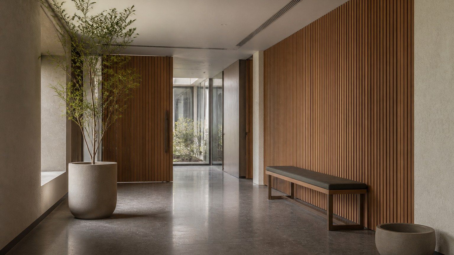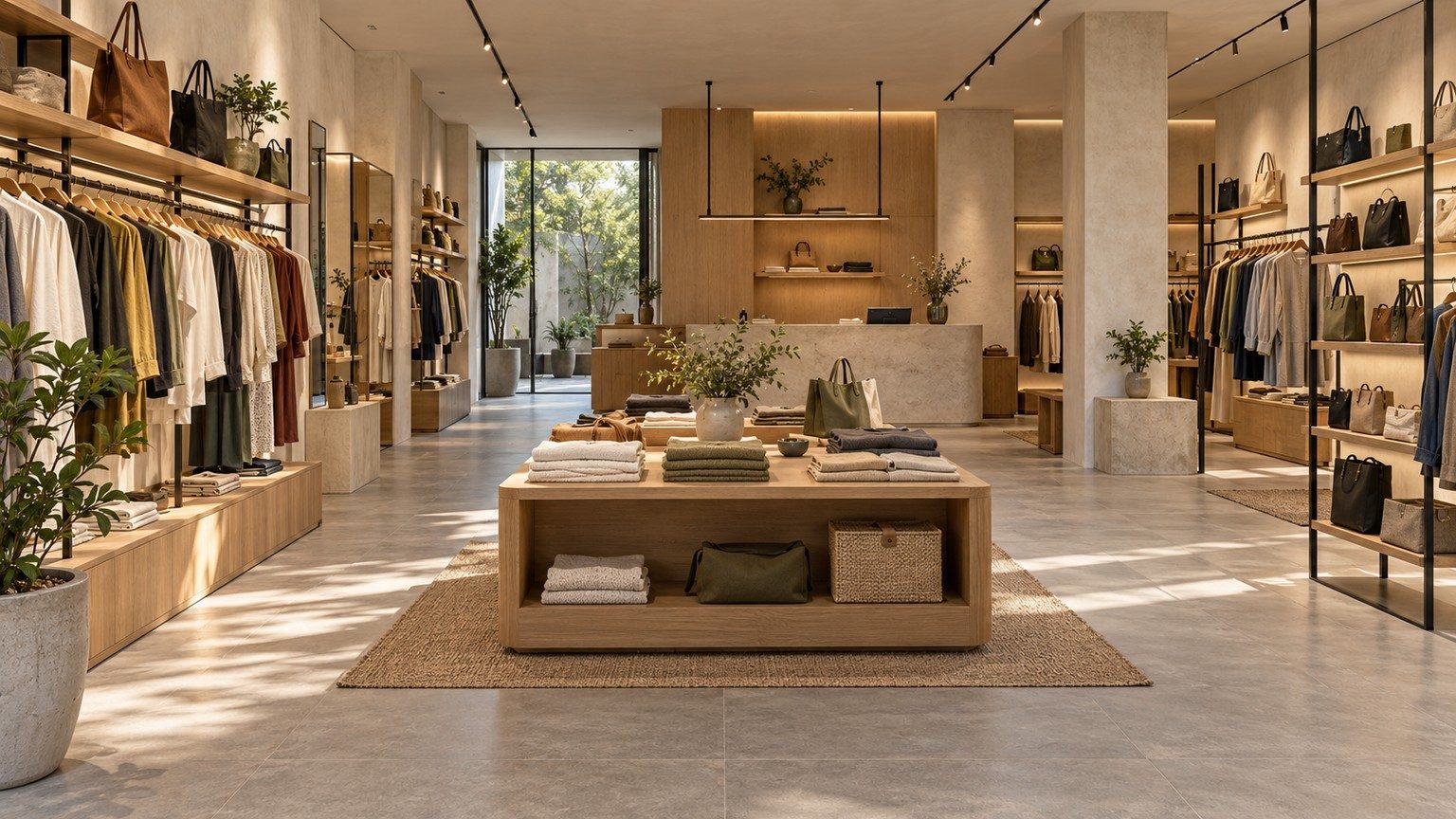
AI-generated editorial illustration. Displays and movement are considered in the same plan.
A display can look composed in a drawing and become awkward when someone stops beside it. A counter can appear generous until the payment terminal, packaging and cables arrive. Storage can disappear neatly behind a wall while leaving staff with a difficult route to replenish the shelves.
These are interior-design decisions. They affect fixture proportions, lighting positions and how much of the floor can reasonably hold merchandise.
Retail store interior design begins with those relationships. Products need to be seen and handled. Customers need to understand where they can go. Staff need to assist, replenish and maintain the space. Brand expression becomes convincing when it carries through this ordinary work: the way a shelf holds a product, the clarity of a display, the material beneath a hand.
Start with the merchandise and the operating brief
Bring the products into the design conversation early. Their dimensions, weight, packaging and method of display are more useful starting points than an image of a finished shop.
Consider a hypothetical store selling bags. A shelf drawn around one compact sample may not accommodate a larger bag with its handles upright. Hanging stock asks different things of a fixture than folded stock. A product that needs to be lifted and examined needs space around it, as well as somewhere to stand.
Display quantity matters too. Decide what belongs on the sales floor and what can remain in storage. Filling every surface may increase the amount displayed while making individual products harder to distinguish. Leaving generous gaps without understanding stock requirements can produce a presentation that staff cannot maintain during an ordinary day.
The operating brief should describe how deliveries arrive, where they are checked, how replenishment happens and what staff need at checkout. It should identify merchandise that changes regularly and equipment that must remain fixed. Those answers give the designer something concrete to organise.
Include the constraints of the premises: entrances, columns, existing services, storage access and any landlord conditions. A useful retail shop interior design brief connects the desired experience to the place where it must be built.
Plan the journey from arrival to checkout
Read the entrance from outside before planning the route inside. What can someone see through the opening? Is the first display understandable? Can a person pause without blocking the doorway?
An arrival area can provide room to orient and decide where to go. Its shape should follow the premises and the way the store is used. Avoid imposing a universal depth or assuming that every customer will turn in the same direction.
Beyond the entrance, examine movement in more than one state. An empty aisle tells little about an aisle beside a customer examining a product. Add another person passing, then a staff member carrying replenishment stock. The drawing should account for the space each activity occupies.
Planning rooms around the body is useful here: fixtures have to be considered alongside the people using them. Reach, stopping, turning and assistance belong in the plan.
Sightlines need the same attention. A low display may leave the next zone visible; a tall fixture may provide valuable capacity but interrupt that view. Position and density matter as much as height. Check the store from the entrance, the browsing route and staff positions.
Choose a layout for the store’s constraints
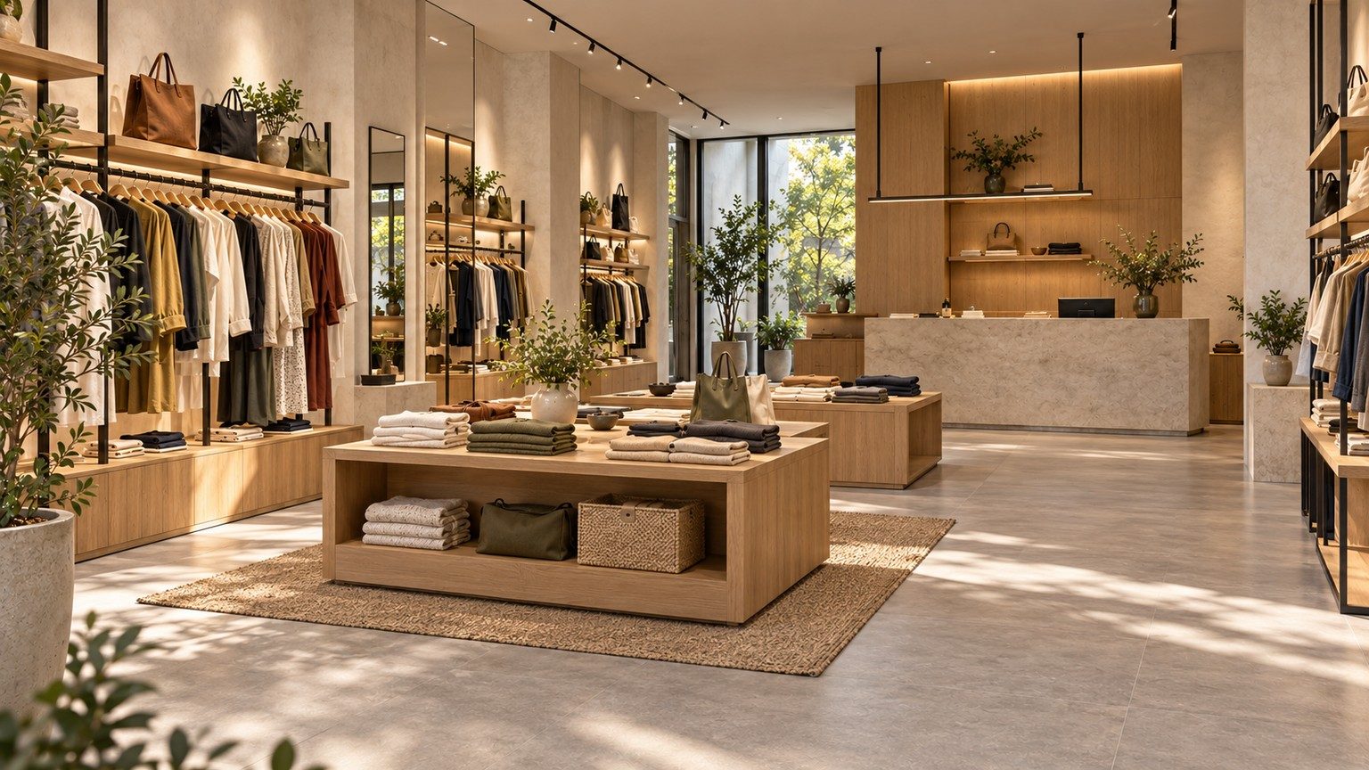
Grid, loop and free-flow arrangements offer different ways to organise merchandise and movement. They provide vocabulary for retail store layout design, rather than prescriptions attached to particular store types.
A grid uses repeated runs of fixtures and aisles. It can make product grouping and navigation legible, particularly where consistency matters. Its usefulness depends on aisle connections, fixture lengths and how readily people can cross between runs. Repetition should not leave the entrance crowded or stock access trapped behind browsing customers.
A loop establishes a recognisable route around part of the store. It can connect merchandise zones and provide a clear sequence. It also raises a question: can someone reach a particular product or checkout without completing an unnecessary circuit? Cross-connections and alternative routes deserve attention.
Free-flow arrangements allow more variation in fixture position and route choice. They can respond to an irregular footprint or changing displays, but need enough visual order to remain understandable. Individually attractive fixtures still need to form a coherent layout.
Mixed arrangements may resolve the actual premises more sensibly than a pure type. A repeated wall display can sit beside a looser central arrangement. A column, stock-room door or fixed service position may determine where that change happens.
Judge the resulting plan against merchandise, movement and operations. The layout’s name matters less than whether its routes, fixtures and access points work together.
Give merchandise a clear visual hierarchy
Decide what the customer should recognise first, then what needs closer examination. A focal display, supporting products and deeper stock should not all demand the same attention.
This hierarchy can come through spacing, grouping, fixture proportions and light. It need not depend on stronger colours or more decoration. If every display is treated as a feature, the products begin to compete with the interior around them.
Review fixtures with representative merchandise in place. Check whether packaging hides the product, whether shelf depth makes smaller objects difficult to reach, and whether a display remains clear when partly depleted. An empty joinery elevation cannot answer these questions.
Brand identity should inform the same decisions. A repeated metal detail, consistent edge profile or restrained colour used at useful moments can give the store continuity. Logos need not carry the entire identity.
The relationship between a fixture and the room also matters. Millwork as architecture considers joinery as part of the space. In retail, that means coordinating displays with walls, services and circulation so they do more than occupy vacant floor area.
Review the fixture with merchandise on it and people beside it.
Design lighting around what is being seen
Ambient light makes the space readable. Display or accent light gives selected merchandise emphasis. Task light supports work such as checking products, packing purchases or using the counter. These layers need to be considered together.
An accent can become ineffective in an overly bright surrounding field. A fitting room may be adequately lit yet uncomfortable because the source reflects directly in the mirror. A glossy package can catch a bright reflection that obscures the product beneath it.
Test lighting against actual samples where possible. Look at fabric, colour, labels and surface texture from the positions in which customers will see them. Review pale and dark merchandise, rather than only the product that looks most convincing under the proposed light.
Colour temperature alone does not establish how accurately a product will appear. Source quality, surrounding finishes and viewing conditions also need consideration. A timber surface or coloured wall can affect the light reflected onto nearby merchandise.
Daylight adds another variable. A display close to glazing may look different as the day changes. Assess the proposed lighting under those conditions rather than relying on a single photographed moment.
The Hidden Cost of Poor Lighting extends the discussion of glare and visual comfort. In a store, those questions sit alongside the need to inspect merchandise clearly.
Make the operational spaces part of the design
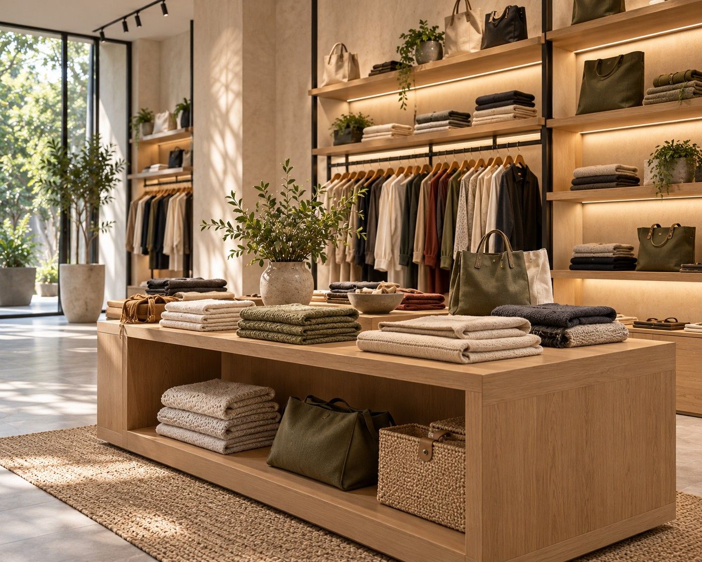
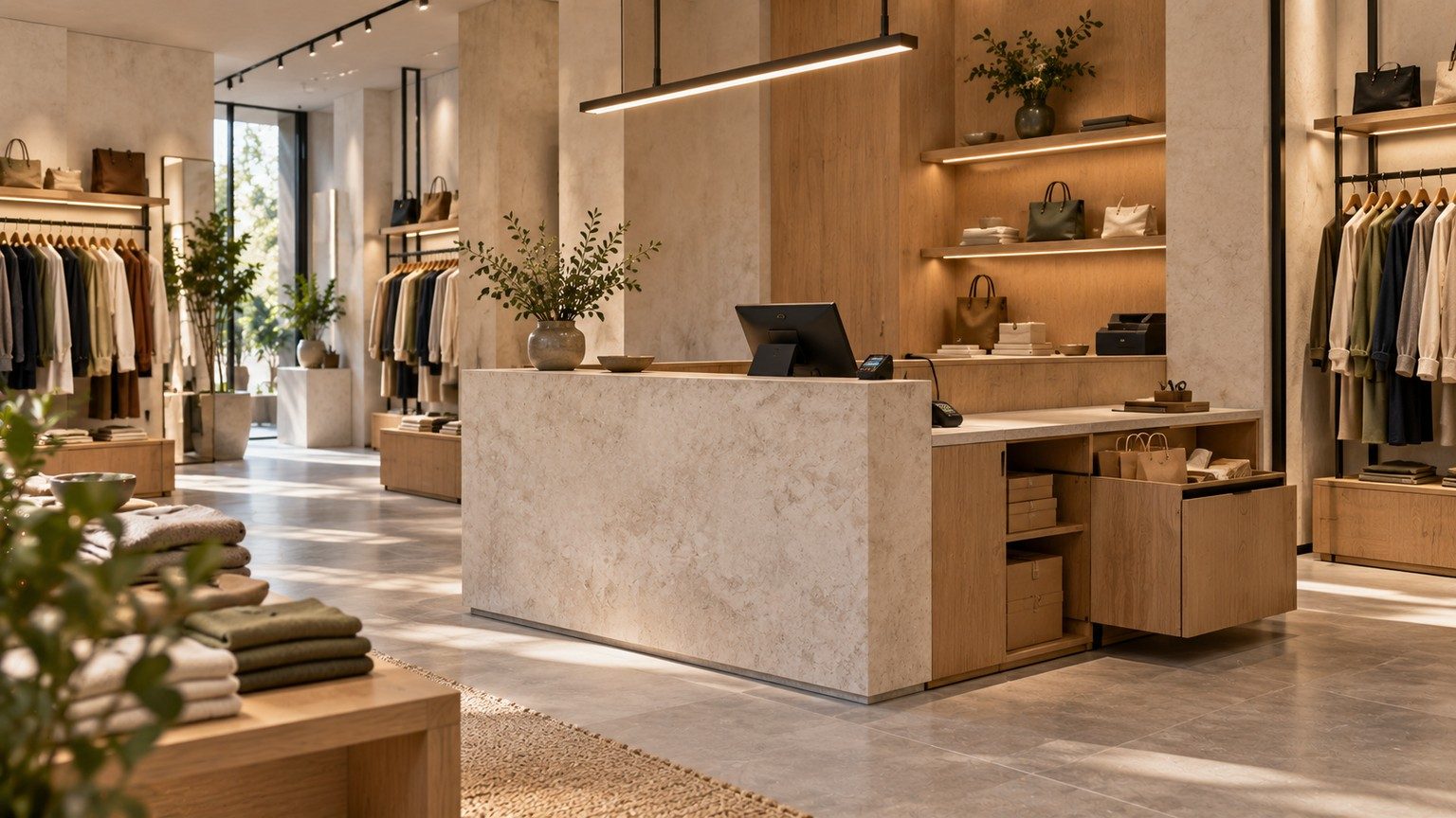
Draw the checkout with its equipment. Include the payment terminal, screen, scanner where needed, packaging, drawers and the working area used to handle a purchase.
Then draw what sits underneath. Power connections, data cables and access to devices affect the counter’s construction. A cable opening added after fabrication can undo a carefully resolved surface. Equipment enclosed without usable access becomes difficult to service.
The customer and staff sides ask different things of the same counter. Consider where someone places a bag, where a transaction happens and how assistance can be provided. Accessible use needs to be resolved for the actual premises and applicable requirements, rather than assumed from the counter’s appearance.
Storage deserves equal precision. Separate reserve stock, packaging, cleaning supplies and staff belongings according to how they are used. A concealed cupboard is useful only if its contents can be reached and its doors can open during normal operation.
Where fitting rooms are needed, consider approach, privacy, mirrors, belongings and staff assistance together. A curtain or door drawn in isolation does not explain how the space will work.
Walk through opening and closing. Where does incoming stock wait? What must be brought out, locked away or cleaned? These routines reveal spatial requirements that a sales-floor rendering can miss. Their place in interior planning is practical: they affect surfaces, access, storage and the room left for people.
Specify for wear, cleaning and change
A material sample is usually seen clean, flat and under favourable light. Its place in a retail interior may be an exposed shelf edge, a repeatedly used counter or a floor crossed by deliveries.
Specify for that use. Consider how surfaces are cleaned, what happens at corners and joints, and how a damaged component can be repaired or replaced. Ask suppliers for relevant performance information rather than treating a finish name as a complete specification.
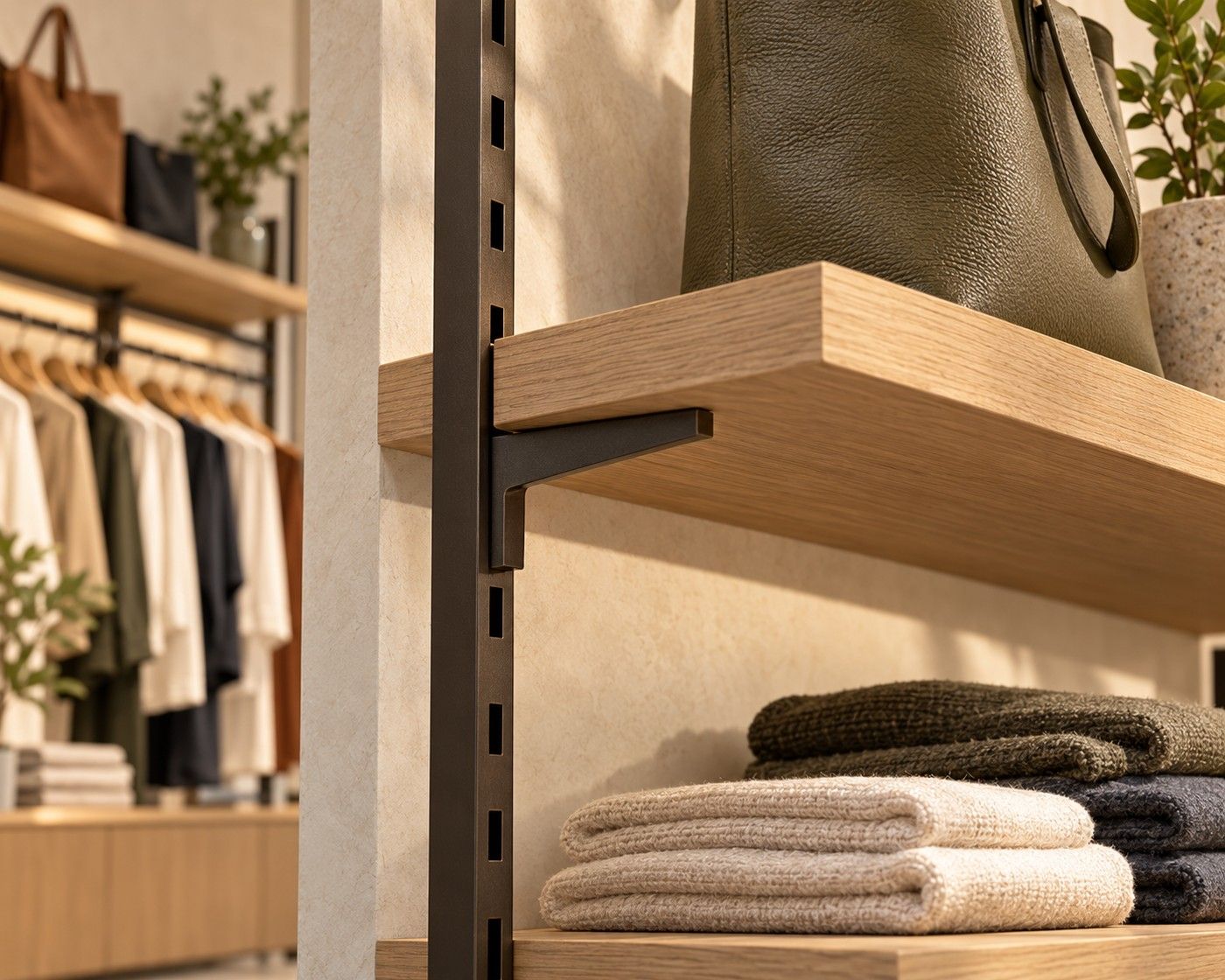
Details deserve particular scrutiny. A narrow recess may collect dust. An exposed edge may receive repeated contact. A drawer handle may look discreet but be awkward to use throughout the day. Resolve these questions in samples and drawings while changes remain manageable.
Merchandise will change. Adjustable shelves, removable dividers and interchangeable display elements can accommodate some of that movement. Their adjustment needs to be practical: clear fixing positions, usable access and components staff can handle.
The broader argument in Sustainability Through Design Longevity is relevant without requiring claims about savings. Decide what should remain stable and what should be allowed to change.
A durable base fixture with replaceable display elements offers a different approach from rebuilding the whole arrangement whenever the range changes. The drawing should make that distinction explicit.
Resolve execution before the opening deadline
The layout must meet the services above, below and within it. Lighting positions, electrical outlets, air-conditioning distribution and other building systems need coordination with merchandise and fixtures.
A tall display can conflict with a proposed light or interrupt access to equipment. A checkout moved late can leave power and data in the wrong place. Storage joinery can conceal something that still needs inspection or maintenance.
Compare the drawings as a connected set. Confirm site dimensions, equipment and material choices before releasing work that depends on them. Where an important junction remains unclear, a sample or mock-up may resolve it more effectively than another perspective image.
Fabrication brings commitments. A fixture made around an unconfirmed product size or device can become difficult to alter. The opening programme therefore needs time for decisions as well as manufacture, installation and checking.
Plan how the finished work will be reviewed before merchandise fills the store. Doors and drawers should operate, equipment should fit, lighting should be assessed and agreed defects should be recorded. These checks are easier to complete while access is available.
The opening date belongs in the brief from the beginning. It should organise the sequence of decisions, rather than become a reason to leave them unresolved.
Review the store in use
Before approving the design, follow three journeys through it.
First, the customer: arriving, finding a product, examining it, asking for assistance and paying. Then the staff member: receiving stock, replenishing a display, completing a transaction and putting things away. Finally, the person maintaining the space: cleaning surfaces, reaching equipment and replacing a worn component.
Use the plan, actual merchandise and equipment information to test those journeys. Where they conflict, return to the drawing. A display may need to become smaller, a door may need to move, or a detail may need to become simpler.
The store’s appearance can develop around this understanding of daily use. Materials, lighting and brand expression then have something specific to support.
For readers moving from these questions into a project brief, Blucap’s Retail Interiors page sets out the design and execution scope.